Vodafone MVA10 • December 2018 - Today
My Vodafone 10 App
MVA10 program is a strategic repositioning of My Vodafone, moving beyond its legacy "account management" proposition to become the primary gateway for sales & service. The aim was to make the MyVodafone application "the digital channel of choice" for all the customers, providing exceptional and unrivalled multi-device account management and care experience.
UX/UI
Experience Strategy
Creative Direction
Design Direction
Service Design
User Research
Task
Investigate the role of the flagship utility app in daily customer routines to overhaul the whole digital experience and roll out to local markets

MY VODAFONE 10 APP
My Vodafone 10 in Numbers


MY VODAFONE 10 APP
My Role in the Project
My role:
Experience Lead
The team:
Product Owner
Program manager
UX chapter lead
Service Design chapter lead
Design Squads X4
VF OMNICHANNEL
VF OMNICHANNEL
As the UI team lead and experience creative director, I'm ultimately responsible for delivering a consistent and meaningful design language aligned with the Vodafone brand identity and the broader commercial strategy. I support the agile team in building the product by leading and participating in design workshops leveraging UDC methodologies.
I regularly provide constructive design critiques aiming to inspire creative thinking and ultimately sign off the design work. I also helped product owners prioritize features and roadmaps based on the balance of business objectives and user expectations.
My Vodafone is Vodafone's flagship digital channel. The legacy application - MVA2 -allowed users to monitor their usage, make payments, seek customer support, reaching more than 41 million active users across 12 markets. But with shifting lifestyles, unlimited data plans, an increasing appetite for digital experiences that deliver more than utility, and a new digital-first strategy adopted by the company, early 2018, it was the right time for Vodafone to make a step-change. MVA10 ambition was to offer greater app penetration, more frequent visits, and increased brand love.
MY VODAFONE 10 APP
The Challenge
a
How do we create empowering, forward-thinking digital moments that inspire our customers to make Vodafone part of their lives?
FUNDAMENTAL QUESTION

Context for Redesign
The old app was well perceived but clunky in the navigation and revealed few pain points we wanted to address. The interaction model surfaced limited scalability because of its old framework, designed to emphasize a few cores uses case (top up, data usage, notifications). The visual design was cluttered and unfriendly, not very connecting the Vodafone brand. The user interface lacked in delivering meaning and delight to Vodafone customers. More broadly, there was a lack of discoverability and usability where specifically, the hamburger menu was tough to access and explore. Along with navigation, there were profound issues in orienting the user through further pages, features, offers, and marketing content.

Functional needs
Until this point, the functional needs were primarily led by business and technological objectives. This graph helped us determine prioritization of the features in particular when looking at a broad audience spectrum It is important for a design team to remember that the app serves as a utility and must satisfy users' needs to give license to include more magical and inspirational moments. The backlog of features for the MLP was created after an analysis of the identified functional needs against our four personas. The needs that are common among all personas were given the highest priority.

Persona
User personas are detailed examples of potential end-users of a specific audience type. Understanding users, their motivations and their requirements is a crucial step in building user-centric products. These personas have been created to bring the user groups to life so that we can understand the challenges they face, the goals they want to achieve, their technological and cultural touch-points, and their general attitudes and behaviours. The takeaway of this exercise was also that Vodafone audience is really transversal and spanning across ages and social layers, therefore a high level of discoverability and usability was imperative.

Persona
User personas are detailed examples of potential end-users of a specific audience type. Understanding users, their motivations and their requirements is a crucial step in building user-centric products. These personas were created to bring the user groups to life to understand the challenges they face, the goals they want to achieve, their technological and cultural touch-points, and their general attitudes and behaviours. The takeaway of this exercise was that the Vodafone audience is transversal and spans ages and social layers; therefore, a high level of discoverability and usability was imperative.
Functional Needs
Up until this point, the functional needs were primarily led by business and technological objectives. This graph helped us determine the prioritization of the features, particularly when looking at a broad audience spectrum. This activity helped the design team to focus on utility tasks and satisfy users' needs. Also, it enabled the team to make a broader assumption on the app's role in the user's lifestyle routines and gave license to include more magical and inspirational moments. The needs that were common among all personas were given the highest priority. In addition, we identified further functional needs against our six personas to ensure the product would target our users more broadly.
After the analysis, we created a features backlog for the MLP working in synergy with the product owner and defined the product development roadmap
My Vodafone 10 is the place where you can easily manage your current Vodafone product and services whilst discovering further opportunities for greater/safer/better-connected living.
CUSTOMER PROMISE
100% Analysis
The 100% analysis was pivotal to anticipate how users would navigate MVA10. This exercise helped to understand, based on MVA2 user activity, how features would transition into the new application to ensure we gave prominent entry points to key features and enhanced customer usability. It also enabled the introduction of new technological capabilities further to unlock opportunities for the business and our customers.


App Archetype Attributes
To help establish our design framework, we run workshops to determine the application attributes. We provided four groups of individuals with versions of the Carl Jung archetype wheel. Working together, we tasked the groups to stick dots around the wheel to denote which characteristic they felt were most relevant for the MyVodafone10 app. Each group played back their opinions, and collaboratively, we discovered that the Magician personality was the most appropriate trait, given its flavour of achievement, surprise and vision.

App Persona
Also, we personified the app itself to make it more familiar and tangible. We gave a name based on our understanding of the customers and the Carl Jung wheel exercise outcomes. We choose Eva, as the name celebrates life. She is a friendly, independent, and tech-savvy mum who likes to communicate informally and solve problems quickly. Most of all, she cares about others and loves to stay close by celebrating successes.

Nielsen Norman Group
Design principles help to keep fundamental values front and centre in the design process. Design principles ensure consistency in decision making across designers and teams, removing the need to debate simple tradeoffs and letting designers worry about complex problems.
DESIGN PRINCIPLES
Design Principles
During our discovery phase, we defined the overarching design principles for the experience. These statements soon became the north light for any decision taken. The whole design community took advantage of these during any design conversation, ensuring a consistent and pre-determined approach was at the foundation for any strategic, interaction or visual design tasks.


Interaction Model
The new and simplified design architecture splits the MVA10 experience into four key pillars. A significant amount of the app's content can be discovered simply by scrolling down – the user never even needs to click to see the latest offers available to them. Billing and used data are available at a glance on the dashboard. Thanks to the simplified tray, a deeper dive into products and account information is never more than a tap away, including quick access to - TOBi- the Vodafone digital assistant. This last feature enabled us to expand app discoverability exponentially by granting Tobi the opportunity to establish a more human and conversational relationship with the customer.

Information Architecture
As part of our process, we mapped out in more detail all the key journeys. This initiative helped determine the depth of the experience and the opportunities for cross-linking core functionalities, promotions, commercial opportunities and easy access to account information and settings. Also, quite soon, we understood that it was important not to create too many layers to drill down. This guarantee safe and intuitive navigation throughout the whole app.


User Journeys and Wireframing
The steps and actions that the user is making often involve important decisions around data settings and money management, meaning that the navigation had to be as intuitive and straightforward as possible. Here are some examples to showcase the complexity of the customer journeys, always being loyal to one of our design principles - One step at a time.


Visual Explorations
Visual design is a critical element for a successful user experience. After the proposition and interaction were clear, we pursue a deep design exercise to nail the app visual identity. We organized a design spike lasting two sprints within our D10 program leveraging agile operation with the team. The objective was to nail the aesthetics and layout to ensure we would bring the Vodafone brand to life in all its vibrancy. As UI team lead, I led the whole initiative by providing design direction and guidance to the designers and elements for inspiration. We explored a variety of options to maximize opportunities and determine the best approach possible. Here is a summary of the outcomes with a short synopsis for each proposal.

Visual Design Principles
Following the explorations, we understood that we needed a few design pillars to guide us through the process to drive our visual design execution. We decided that MVA10 must be light and straightforward to use, stripping away all was unnecessary – so that relevant content could surface clearly and encourage further exploration. The primary Vodafone colour palette and greyscale were other pivotal elements to make the experience identifiable and unique for Vodafone. Moments of magic and delight would be conveyed, delivering purposeful and delightful animations. And finally, vibrant photography and images linking to VF products would elevate the experience making it personal and entirely consistent with the Vodafone brand.


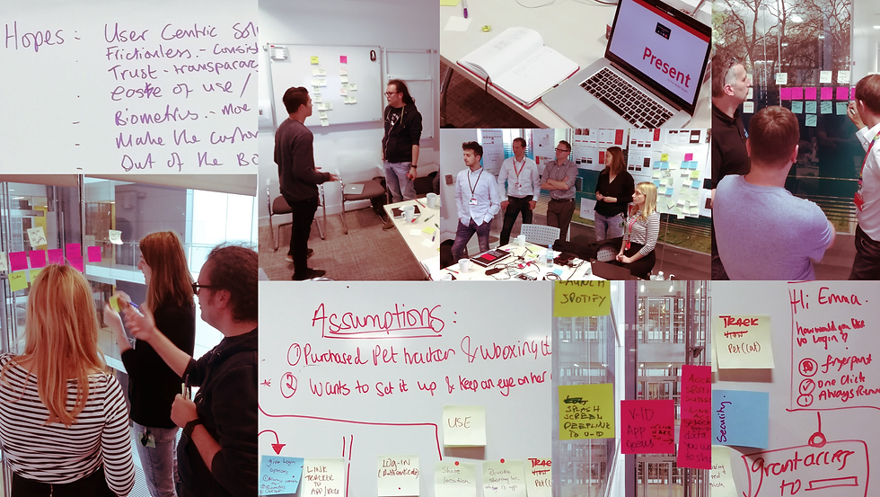
User Research and Testing
UDC practices were critical throughout the whole process. Not only in the conception phase by also during the production of all the customer journeys we delivered. We conceived the majority of our outputs by collaborating tightly with the markets, which were involved in the design process throughout the project. We invited local members from the global design community to participate in workshops and creative activities. This practice allowed us to understand the market's reality in more detail and enabled the local team's members to become ambassadors of the design philosophy once back in their teams.

Service Design and User research
Working in great synergy with the service design team, we also conducted several quantitative and qualitative research to help our decisions and validate our design thinking. And to continually reduce the gap between customer expectations, user needs and final execution. Below you can see an excerpt from the A\B testing report. This document was the outcome of our research to validate the tray bar's usability and inform how the customers understood its functionalities.


Final Design
All the above processes and learnings helped us address the core challenge set at the beginning of this development journey - to deliver against our digital-first commercial strategy and digitally transform the whole organization. But even more importantly, it allowed us to create a well-balanced and scalable application that blends form and function seamlessly and guarantees an intuitive, discoverable and delightful experience to our users.

Delivery at Scale
By starting the MVA10 development journey, we soon realized that distributing guidelines via pdf and share assets on remote drives wasn't the ideal experience for designers and developers, causing lots of headaches in finding the proper guidance. And from a result perspective, the old approach of distributing guidelines created a lot of inconsistencies and arbitrary decisions. For this reason, we started building Source, the VF design system aiming to consolidate the distribution of assets and documentation to avoid duplication and ultimately increase efficiency and creativity.
Below are some excerpts from the Group Reference Design Guidelines, which is now at the 9th release with more than 27 customer journeys across channels, seamlessly delivered to the markets for implementation. We create documentation by illustrating screen by screen progression, including annotations to provide further clarity and a fix-flex-free model that allows each country to customize design components. This model enables the markets to effectively address local needs while staying loyal to a unified global design language.


